
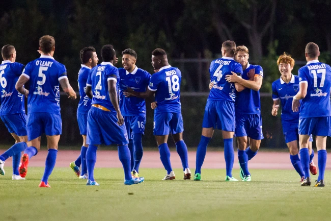
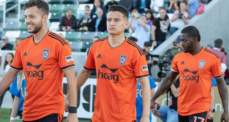
15 years of Orange County Soccer Club, in various names, have come and gone. The Orange & Black have worn a multitude of different looks and identities. During those 15 seasons they have worn 34 different kits, from the standard home and away sets to full season third kits and even a number of once-off special occasion kits. Through a week-long effort sifting through numerous different online sources, we finally have a complete listing of every jersey worn by OCSC.
Not every kit was easy to find much, let alone find any information on. This is common theme among the early OC Blues days. In fact, there is only a single piece of video evidence for one of the kits.
We begin in 2011.
2011
2011 saw the debut of the USL Pro division, which we now know as the USL Championship. It was originally a third division in the US soccer pyramid. The Los Angeles Blues were one of 15 teams that took part in the inaugural season, with the Blues the only club located West of the Mississippi river. The Blues were originally a part of the larger “Pali Blues” soccer group, with a women's team playing in the USL-W league and even featured a development team. They went with this as their badge, and despite an average season, made the playoffs but exited in the first round.
The LA Blues designated Cal State Fullerton’s Titan Stadium as their “home” venue but really played home games all across the greater Los Angeles region, from Pacific Palisades to Norco. They did so wearing these:
Away
Home


Nike was the first kit supplier for the Blues and, in what would become a trend, supplied template kits. At home, the Blues went with a light blue top with white shorts and a very similar navy blue away kit with an added white stripe down the middle. There were no sponsors. The sister team Pali Blues wore very similar uniforms as well. I prefer the home light blue kit of the two and feel that is a very safe, non-offensive look for a first year team.
2012
It did not take much time for the Blues to make some big changes, and after just one season they changed their crest to this:
I cannot say that I am a massive fan of either of the first two logos worn by the LA Blues, for a number of reasons, but my oldest OCSC kit that I own is from this season (2012 training kit) so I like this crest just a bit more. However the match uniforms from this season are not much better either.
Home
Away

Yes, a team called the “LA Blues” wore black at home. But only sometimes, as it was not every home game.
The kits are not that bad looking and black would become the traditional home color down the line, but this is still a bit of a questionable creative decision from either the club or Nike. The away kit was nothing special either and was an inverse of 2011’s home kit.
I do think the updated logo looked better on the shirt than the original one, but that is about all the praise I can think of. The 2012 season overall was nothing special either, as the club failed to make the playoffs.
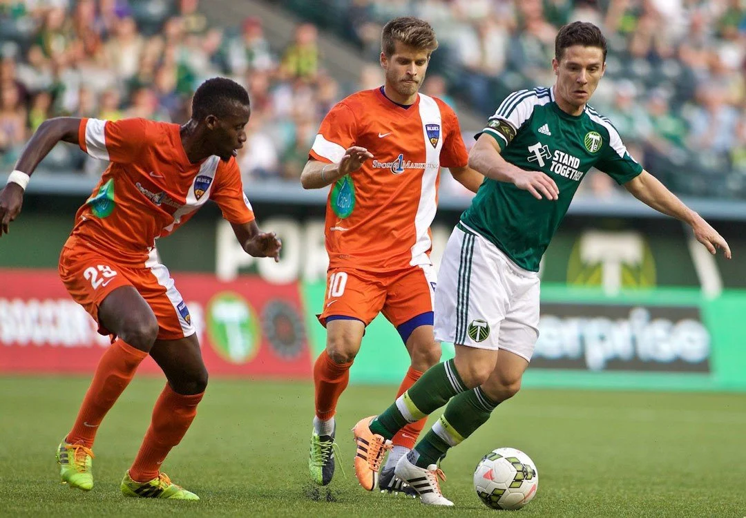
2013
2013 would be the last season under the LA Blues moniker and they end the era with easily the best kit of the young club’s existence.
Home
Away

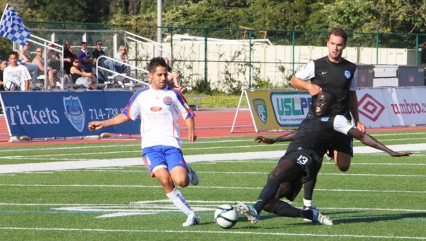
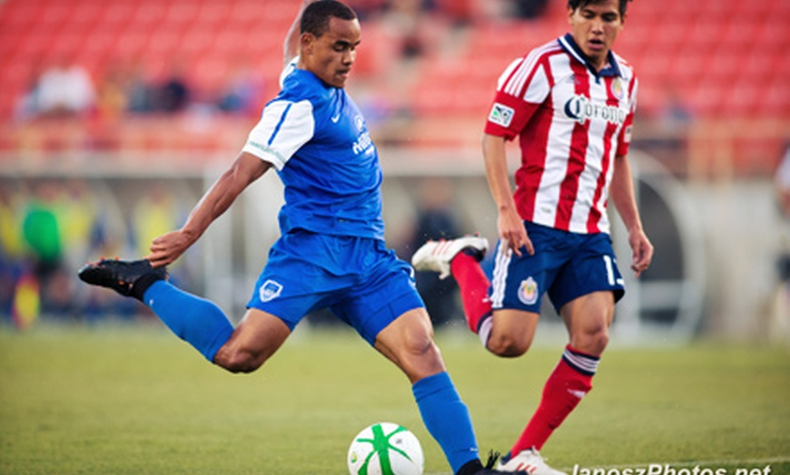
The 2013 LA Blues come into the season with a royal blue home kit. They also are the first kits to have a primary sponsor, with Hilton Hotels adorning the front of the shirt.
While researching this article, the majority of these images came either from archived news articles or full game replays, which from early 2010s lower league American soccer, were not easy to find. I did not know this away kit existed until near the end of my research. This image came from a screencap of a full game replay of the Blues match up against the Rochester Rhinos. As far as I am aware, this is also the only digital evidence of these kits even existing. I really do like these Nike kits and think they are the best from the LA Blues era.
2013 ended with another playoff berth and another quarter-final loss.
2014
2014 was a pretty important year for the USL as a whole. This was the year where we see a lot of expansion teams pop up, especially in the Western Conference, some who would grow into major rivals. After three years, the LA Blues moved south from Cal State Fullerton to UC Irvine, and with it changed their name: the LA Blues became Orange County Blues FC. With the rebrand came a new crest…
No more chrome to be found and a splash of color was a good start. The jerseys themselves weren’t too shabby either.
Home
Away

There was a lot to unpack in 2014. Sports 1 Marketing takes the primary spot on the shirt, with sponsors on the side and lower back appearing too. This is also the first OC set to feature collars on the kits. I am personally a fan of collared kits but I am not a fan of putting white numbers on white kits. Either way, they are now good kits in consecutive seasons.
But the results differed: in an expanded league, OC finished 13th and far short of playoff contention.
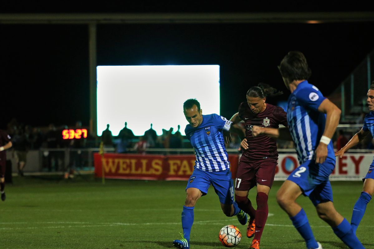
2015
A new year brought another new crest:
But the 2014 home kit was so nice that they kept it again for 2015, albeit with updated sponsors and a simplified USL patch on the arm.
Home

Away
The 2015 away kit was the first orange kit in club history is the one that really pops out to me. It is the same template as the 2013 away kit, which I already had praise for, but now in a better color. Having the orange shorts also allowed for more customization, with OC wearing their orange shorts with blue tops for just one game against Arizona United. In my opinion, these are the best kits thus far.

As far as results went, Orange County won the west in these kits, but again exited in the quarter final round of the playoffs.
2016
The 2016 season would be the final one played at UC Irvine, as well as the last season under the Mansouri ownership. They went into the season with a bit of a different look.
Away
Home
OC were rocking stripes for the first time in club history, again without a primary sponsor. The home kit had more going on, with white stripes on a blue and white gradient. There were still side and lower back sponsors. These were the kits worn for OC’s upset over first-seed Sacramento in the playoffs.
The away kit continued the trend of being orange. It was not a bad kit by any means but it looks more akin to a training shirt than anything.
This marked the end of the Blues era, as after the season they would rebrand again. This would also be the end for Nike as the kit provider. With James Keston buying the club, the team would officially enter into what I call the modern era of Orange County SC.
But the Orange County SC era would not get off to a good start regarding uniforms.
2017
The blue of Orange County are retired and was replaced with black. Orange County SC moved from UC Irvine to the newly minted Orange County Great Park and eventually to Championship Soccer Stadium in August of that year. While the club waited for it to open, they played eight of their first nine games on the road and a handful of home games in a temporary stadium right under the shadow of the big orange hot air balloon (ed. note: better known affectionately as “SkyBol”).
This was also the beginning of Adidas as the new kit provider and it was unfortunately a bit underwhelming.
Away
Home


The obvious thing about these jerseys is the primary sponsor, or lack thereof. OCSC did not have a primary home sponsor on their kits until midway through the season, when Hoag would come along. There is a contingent of soccer fans who like very simple kits, but this is a bit too minimalistic for my liking. The home kit looks a tad better than the white.
Without the sponsor (but honestly, even with the sponsor) it does not look like OC made any effort with the uniforms. Or perhaps all the effort was put towards the logo which we are all familiar with. There is an argument to be made that, with these being template kits from Adidas, that OC might not have much or any say in what they received, but I cannot imagine paying money for a blank Adidas shirt with just a badge. All in all, it was a disappointment considering the fairly strong uniforms the club wore for the previous three seasons.
2018
2018 would be the first full season in Championship Soccer Stadium for Orange County SC and they would not change much at all from a uniform standpoint.
Away
Home

Home kits in 2018 remain exactly the same from 2017. The white kits however now get orange stripes going down the side to match the home kits. For that reason alone they are better. I really wish that I had more to say about 2018 because this was a super fun season. OC were the best team in the Western Conference and made it all the way to the Western Conference Final. This was also my first season of going to games so there is some sentiment for that.
2019
The 2019 season had a lot of expectations going in with a very strong squad. The uniforms would slightly change but mainly remain the same.
Away
Home

Instead of the stripes going down the side like the previous iterations they are now on the shoulders. The USL patch does also change. Those are the only changes. But for what looked like to be three consecutive seasons of the same formula for OC kits of black at home and white away was shaken up when OC debuted the club's first ever third jersey.
Third
Orange had made its return for a team called Orange County SC. These kits were introduced halfway through the season and would be worn for every home game for the rest of the season. Even though it is just an inverse of the other kits, the shade of orange is a bit darker than the previous times it was used and in my opinion is simplicity done right. To me this is the best kit of 2019 and OCSC management would agree with that with next season's kit.
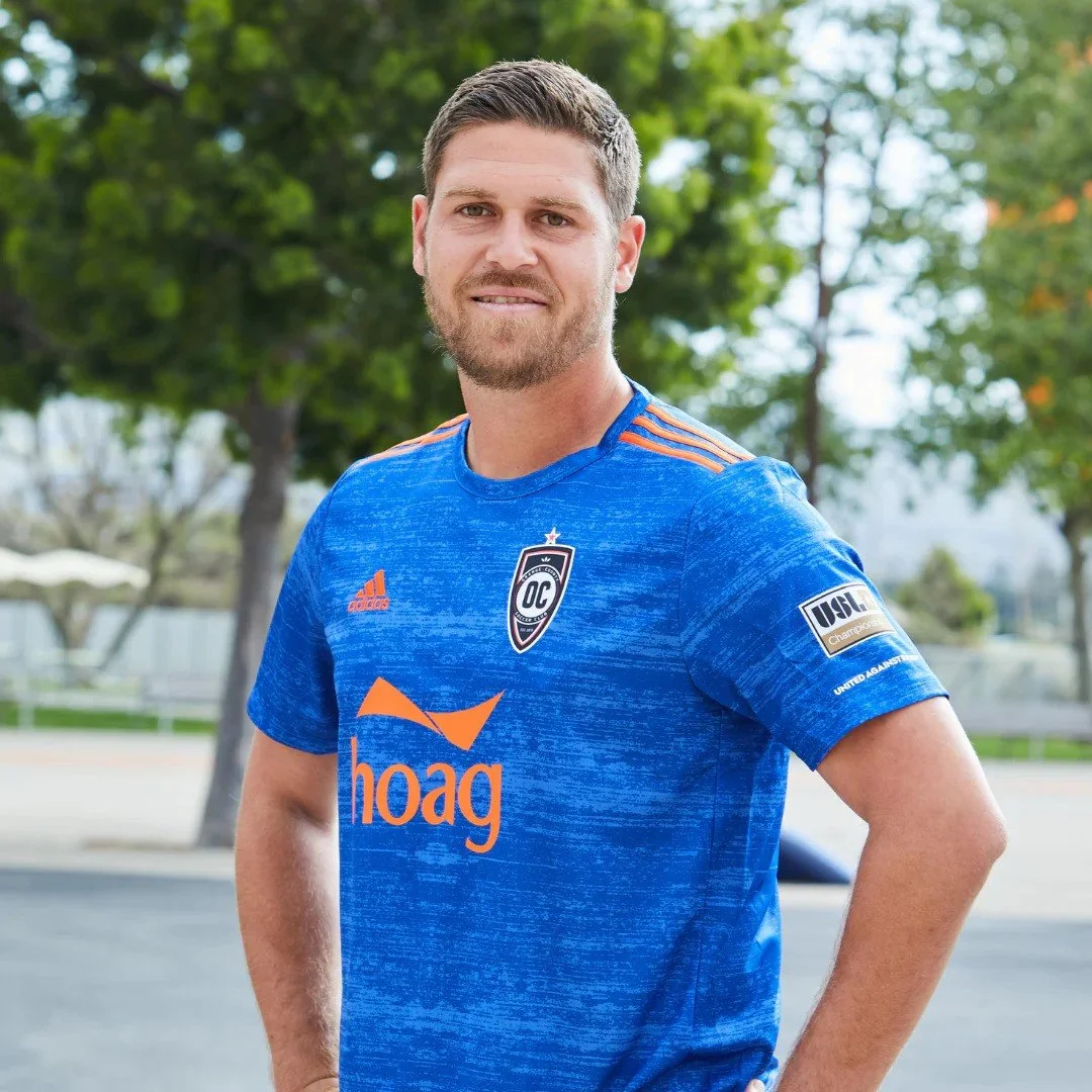
2020
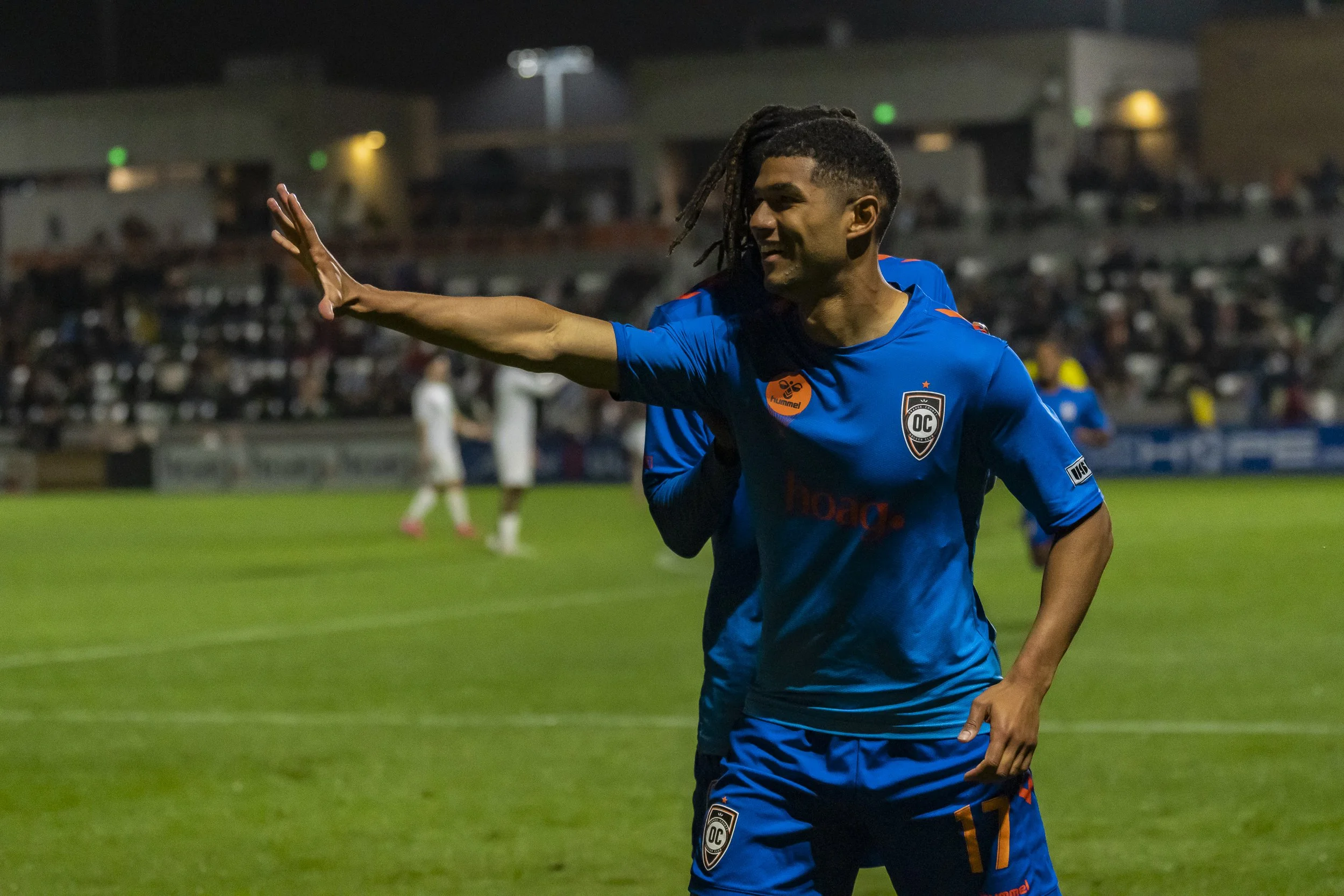
The 2020 season was challenging for very obvious reasons. The elephant in the room is the COVID pandemic which greatly shifted the USL season to one that would be more geographically focused and without any fans in the stadium. OC would also not have an official third kit this season but would make orange the primary color.
Away
Home


The orange is now brighter and the Adidas template here works a lot better than the previous years. With orange being the primary color of the kits now, you will start to notice a gradual decline in the rate that the away kits are worn during the season. Since orange is not a common color used by other teams and can be bright enough to differentiate. I do actually like both kits this season and consider this to be the best OCSC kits to this point. Orange County in 2020 also introduced their first of two special one-night kits.
“CHOC Night” Special
On September 18th, 2020, Orange County wore special blue kits with a yellow ribbon above the adidas logo for CHOC night. The kits were then auctioned off after the game with proceeds going to CHOC. This was the first time that Orange County SC wore blue kits since the 2016 OC Blues days and they were pretty pleasing to the eye as well. Considering what was released next season, I like to think that this was a trial run to what a blue kit would look like with Adidas. The kit is still a standard template used by Adidas, but either way: a cool little moment in kit history.
2021
2021 might go down as the most exciting season for Orange County. Yes it will be forever monumental as the year they win their first trophies in club history with both the Western Conference title and the elusive USL title. But what people might not remember is that OC actually fired Braedan Cloutier midway through the year.
Under his replacement, Richard Chaplow, Orange County went on an incredible run of form right before playoffs started and rode it all the way to the end. They did so with a pretty simple look.
Home, Away, and Third

The biggest note to make of the kits this season is that the listed “away” kit was the black one in the first image. It is an inverse of the kits from 2020. However Orange County technically never wore the kit during competitive games. They only wore it for a couple of preseason games.
The blue kit took up a lot of the games on the road. The orange and blue kits from this season have the same heathered Adidas template look with both kits looking very similar to ones previously worn (2018 orange third and 2020 CHOC night).
The blue kits especially will be a fan favorite for many, as that is what was worn as the club lifted its first cup against Tampa Bay in the USL Final. The jerseys would be so well received that would be just the second kit to be worn across multiple seasons.
Orange County also had a one off jersey worn for Mexican Heritage night.
“Mexican Heritage Night” Special
Worn against Phoenix on October 13, this was the exact same instance as the CHOC kit with the kits being worn for one game and then auctioned off after. This is easily the craziest kit worn by OC in club history. I am a fan of it for its bright colors after years and years of wearing virtually the same kit every year. I do not ever see OC doing something like this ever again but it remains another fun note.
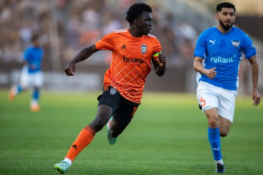
2022
Let me set the stage for 2022. OCSC are coming off their first title in club history. They announce a multitude of returning players and the first full year under the head coach who led the team to said title. So everyone was a bit surprised and disappointed when the team finished last in the West. Add in stadium drama and 2022 was a trying year. The kits this season were not anything too special either.
Away
Home

Third
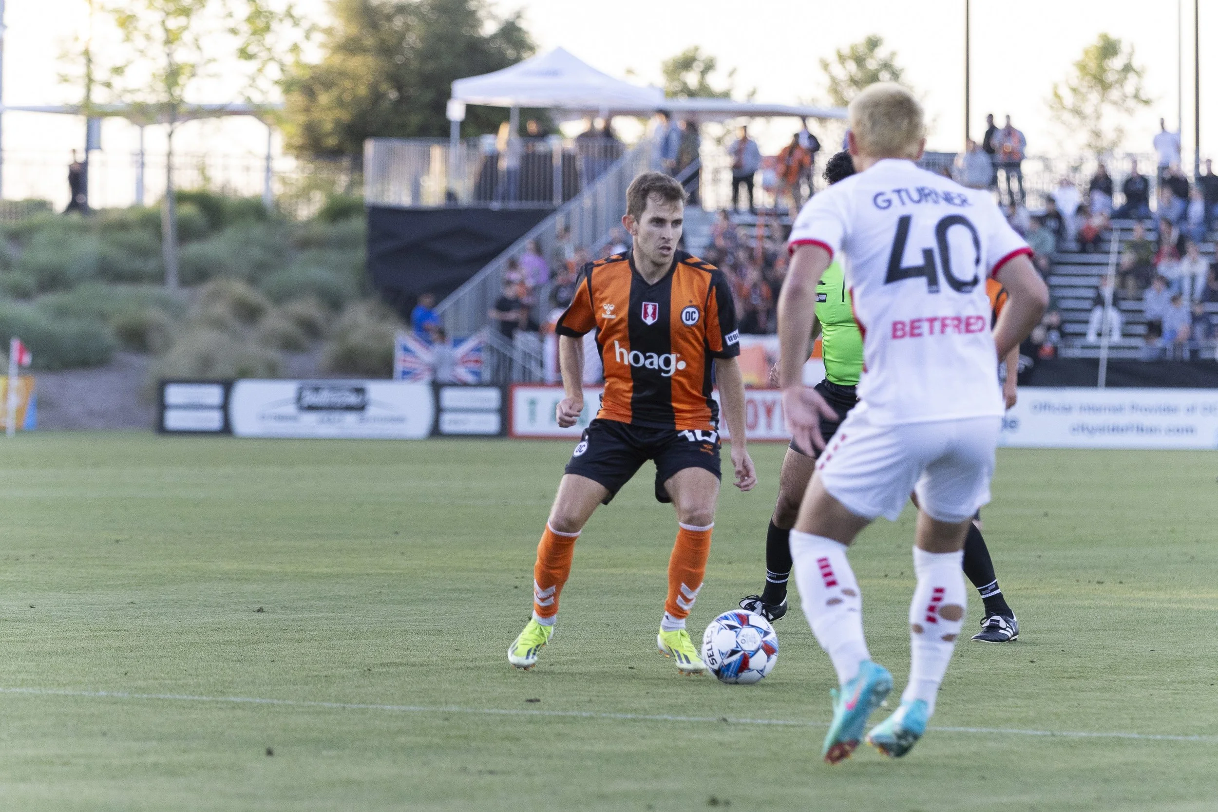
A star representing the 2021 USL Cup Championship was added above the crest in 2022. The home kit goes back to the darker shade of orange from 2018 and had a diagonal line design. I actually really like this design overall but I have heard some fans call it tiger stripes. Adidas really loved their heathered look from last season and made an inverse of it for this year's away kit.
For good measure, they brought back the blue kit as well. To this point, Hoag had been the only sponsor for the entirety of the OCSC era but in 2022, Omega Accounting appeared on the lower back of all kits.
So, for the jersey purists: the only difference for the blue kits is the added star and extra advertisement.
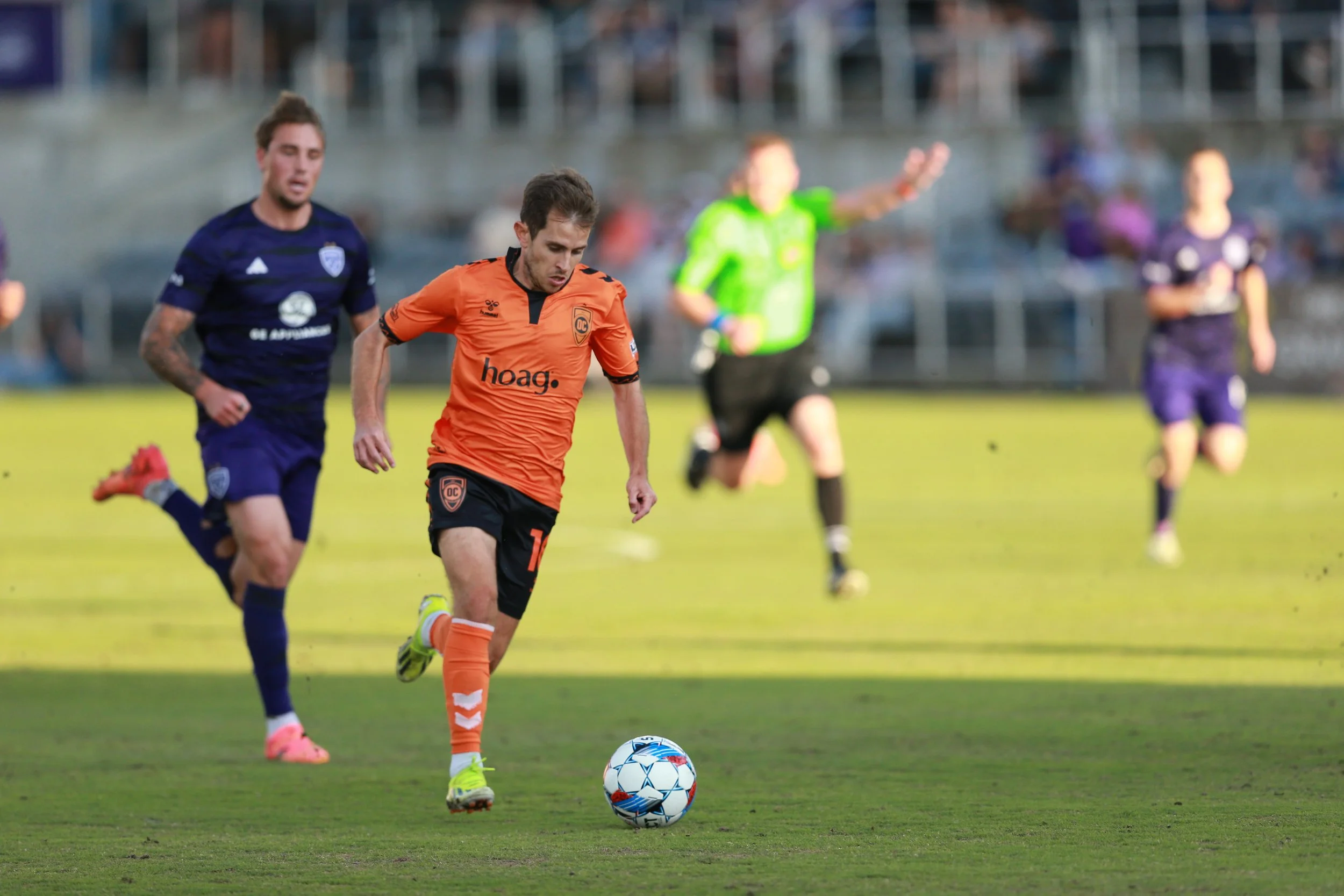
2023
2023 would be the last season for Adidas and they would celebrate it by delaying the home kit due to issues on their end. Allegedly. For the first 6 games of the season OC wore their away kit and did not officially release the third kit until midway through the season.
Away
Home

This is an Adidas template kit that was nothing really special with the orange kit. I made that discovery at a game when I saw a Pittsburgh fan wearing the same exact template kit but in black and yellow. Louisville City has a white one too. Even though I do not think this year's home kit is anything special I am actually quite a big fan of the away kit. The gray design on the front is bold enough to be seen and contrasts well with the orange to make both stand out.
If this was the home kit in 2023 I would not have questioned it and I say that as someone who thinks we should only wear orange at home.
We also got a new sponsor on the sleeve: Northgate Markets.
This was technically the 10th season in Irvine and the club had teased a special anniversary kit to be the third jersey this season. Were we going to see a nod to the Blues days? Was it going to be something special to Orange County as a whole like a coastal jersey or nod to the farming industry?
No.
Third

For the 10 year anniversary, OC and Adidas came up with a gold heathered look, making it the fourth differently-colored heathered jersey sported by the club.
I have a lot of big opinions on this kit. Gold has never been a part of the palette for Orange County for a team that has a history of some colorful kits. It is also not even the color for 10 year anniversaries (it’s silver or… blue). There is also a fairly well supported MLS club 42 miles away that does use gold in their kits.
I understand what they were going for but I feel that there were a lot more options to do for a club that rarely acknowledges its Blues history. Is it an ugly kit? No. But there is nothing that makes it special or fit for the purpose it was created for. Considering that USL clubs, on average, do not last long, a 10 year anniversary should be monumental. But the 10 year anniversary itself is strange because it was advertised as the club's 10 year anniversary in 2023 even though the club started playing in 2011…
Let's move on, now to the best year for OC kits.
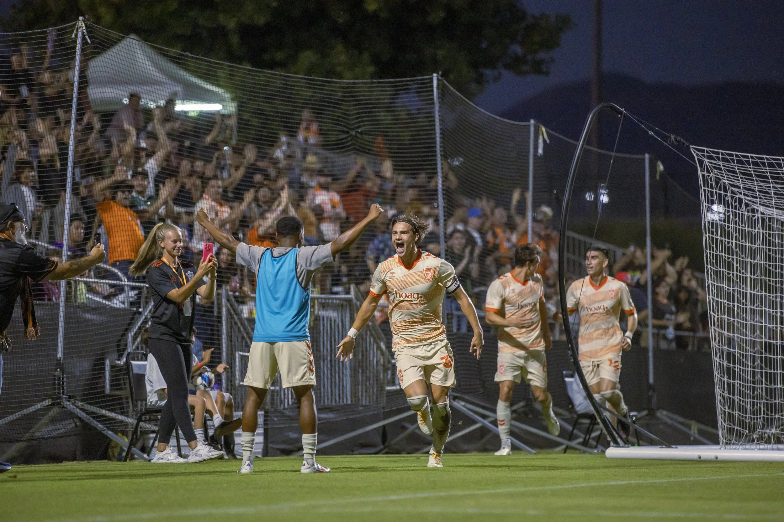
2024
2024 saw Adidas depart and Hummel becoming the third kit supplier in team history. Hummel was not as big of a company as the other two but had a pretty good track record of creating kits for soccer clubs at the size of one like OCSC. The biggest complaint for both Nike and Adidas was always going to be the use of template kits where you plug in colors. There was a rumor that Adidas had connections within the club that also departed after the 2023 season that made the agreement smoother but now Hummel enters the picture.
Away
Home
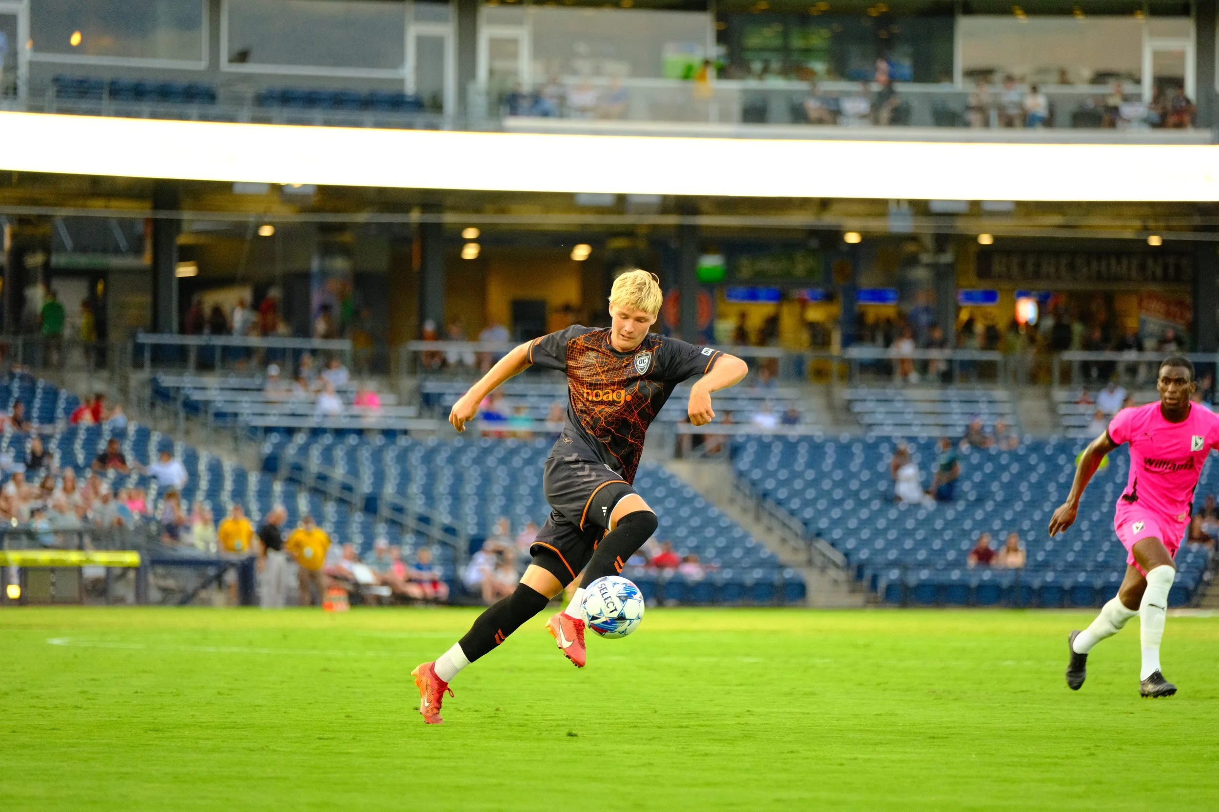
For the first two kits released these are easily higher echelon OC kits. Starting with the home kit, the collar makes a return with a wave design around it and the orange being a lot brighter. This is a simple jersey done well. The away kit however made a lot more splashes with Hummel giving us a black kit with a map of Orange County as an orange detail. This was likely the first kit that Orange County wore where details were given attention to and it shows. Both kits from this point on also have the For County slogan with an OC outline around it on the bottom. Add in slogans in the collar and the details within both kits were very welcome.
Hummel was not finished, however.
Third
As part of Orange County SC’s growth as a club, 2024 saw the introduction of a fan ownership program. At different rates of investment, people could buy “ownership” and get rewarded for it. Smaller tiers would be standard stuff like scarves, tickets, certificates while the more expensive tiers would be pitch side seats, dinner with players and more white-collar stuff.
But somewhere in the middle was a tier that meant your name would be put on a jersey.
This kit was technically alluded to earlier in the season within the fine writing of the ownership tiers, nonetheless, the creamsicle kit was born. The kit is cream in color and has diagonal orange sashes around it. Making up those sashes are the names of the many fan-owners (author’s note: my name is right next to the shield).
Hummel had, in one year, given us three kits that are all easily in the better category of OC kits. They would even gift us a fourth one.
Special
The 2024 US Open Cup was noted for MLS teams opting to not take part due to “schedule congestion.” This was ridiculed by many in the US soccer community with the tournament dating back to the very early 1900s and annually competed by every professional team in the States.
So when OC entered the competition in this polarizing tournament, they did so sporting a kit that paid homage to a kit worn by another team almost a century prior.
Stripes returned to the front like in 2017 and it is really a shame that this kit was only worn for only one game. This kit could easily be a home jersey any year. However OC really put themselves in a corner by making this the Open Cup kit and then immediately bowing out of the tournament.
When this kit was sold to the public, they only sold player grade uniforms, not the replica types that the other Hummel kits came in. This kit also has a minimalized crest that looks like an orange. This kit was cool and really was a shame that it got designated to just a singular competition.
2025
With jerseys specifically, it’s hard to create something that will not be compared to what came before it. Regardless of what the 2025 kits looked like, they would always be compared to the the excellence of 2024.
Away
Home

Similar to 2023, the 2025 home kit this year also got delayed. To make things even funnier, the home kit got leaked on broadcast during an away game by North Carolina FC. Thanks guys!
The home kit had too much going on. It has a subdued shade of orange with a hot air balloon design being the focal point. The bottom of the jersey has a mountain range that wraps around the entirety of the kit. The details are OC-centric, but to what degree?
Sky Bol is hard to incorporate into the kit, and as such, it looks weird from far away. The mountain range, presumably the Santa Anas, look like rocky road ice cream.
The away kit this season would return to gradients and the color blue. It also incorporated the balloon in a much cleaner way. The blue fades from blue to light blue at the bottom and to me is much better than the home kit.
This is more of a USL-specific issue, but this would be the first season with a new league typeface, and that font has a bunch of smaller lines in it that easily peel off. So, no, I cannot say I really liked the kits from 2025.
The fact that these kits are not as good as 2024’s was even more emphasized by the fact that OC still wore both 2024's away and third kits over the 2025 offerings. I cannot even tell you how many times the blue kit was worn in the second half of the season.
While Hummel was going to have a hard time anyway following up the 2024 kits, the 2025 kits were still kind of a let down.
Coming up next… the definitive ranking of all of Orange County SC’s kits, from 2011-2025.